Population
A population map is a graphical representation that displays the spatial distribution and density of the population across a particular geographic area. It provides a visual depiction of the population distribution, allowing for the identification of areas with high or low population concentrations. Population maps typically use different colors, shading, or symbols to represent the population density or the number of people per unit area. Darker colors or larger symbols often indicate areas with higher population density or larger population counts. In comparison, lighter colors or smaller symbols represent areas with lower population density or smaller population counts. Population maps are commonly used in various fields and applications, including urban planning, demographic analysis, socioeconomic studies, public health planning, and resource allocation. They provide valuable insights into population patterns, growth trends, and the spatial distribution of communities. Population maps help researchers, policymakers, and planners make informed decisions related to infrastructure development, resource allocation, and service provision based on an area's population distribution and demographic characteristics.
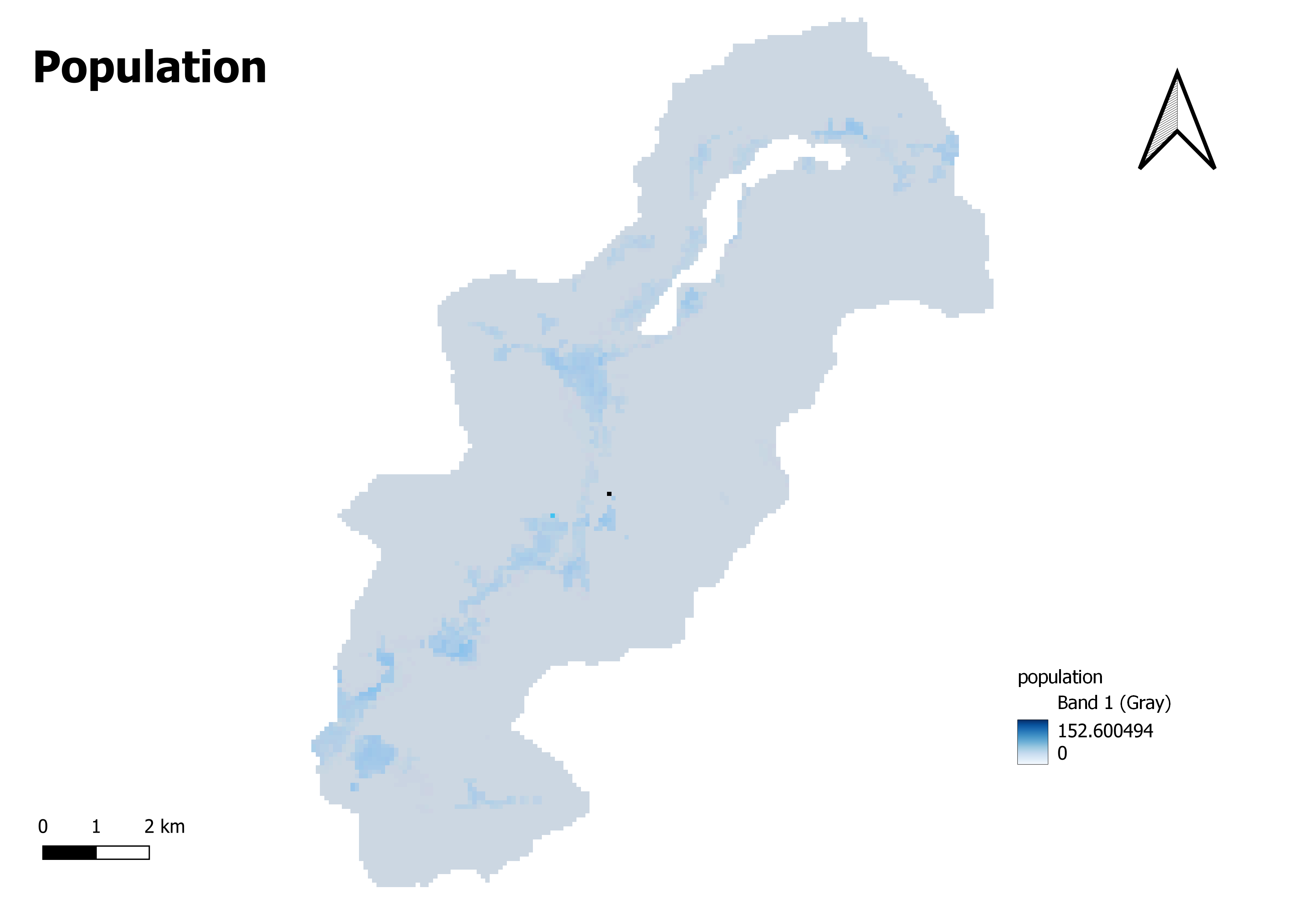
The following is an interpretation of the significance of the range on a population map, especially the range between 0 (represented by the color white) and 152.600494 (represented by the color deep blue), with a color gradient from grey to blue:
Pop_Class_Count
The value of 0 is represented by white, which denotes locations with no people or the lowest population density. These areas may consist of regions devoid of inhabitants, bodies of water, or regions for which population data is unavailable.
The value of 152.600494, represented by the deep color blue, indicates locations with the highest population density or the biggest population counts. These regions often correlate to urban centers with a dense population or regions with a high population concentration.
Grey to Blue: It is believed that the spectrum of colors extending from white to deep blue, with a gradient from grey to blue, depicts the intermediate levels of population density. These numbers reflect places with varied degrees of population density, and as the population density grows, the intensity of the blue color may become more profound. The areas represented by the shades of grey may have a lower population density than the ones represented by the deeper blue colors.